Home Decor
Vintage Living Room Color Palettes That Make Your Space Feel Timeless
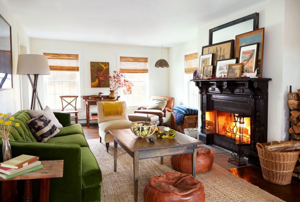
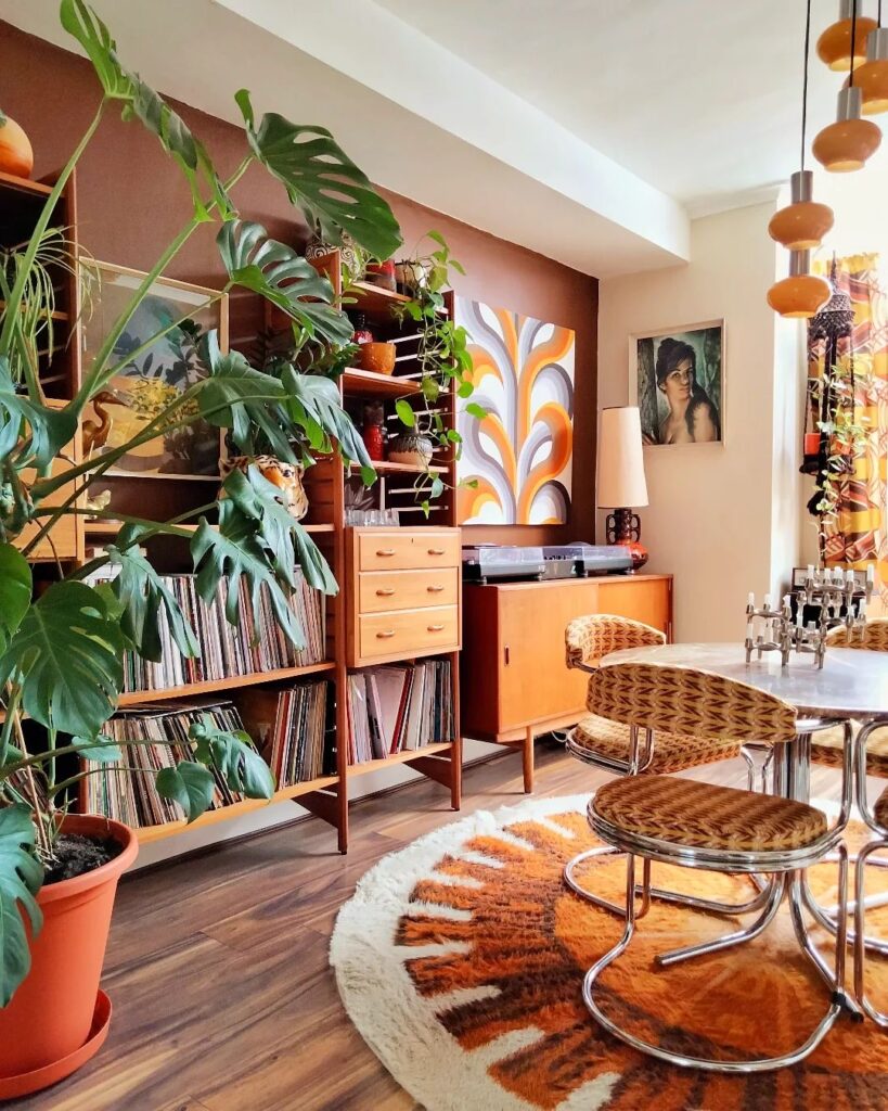
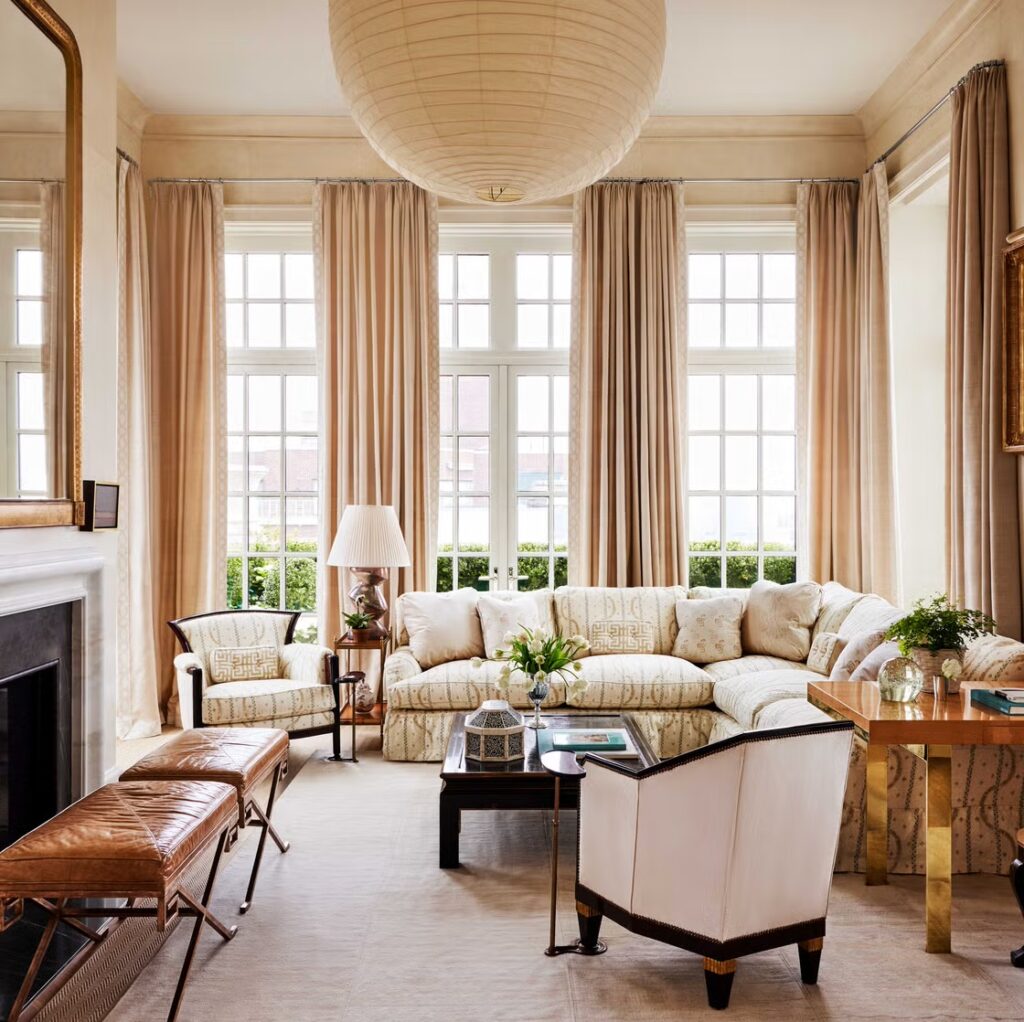
Color is often overlooked, but in vintage design, it’s what quietly holds everything together.
The right palette doesn’t just make your living room look better — it makes it feel right.
The Classic Warm Neutral Palette
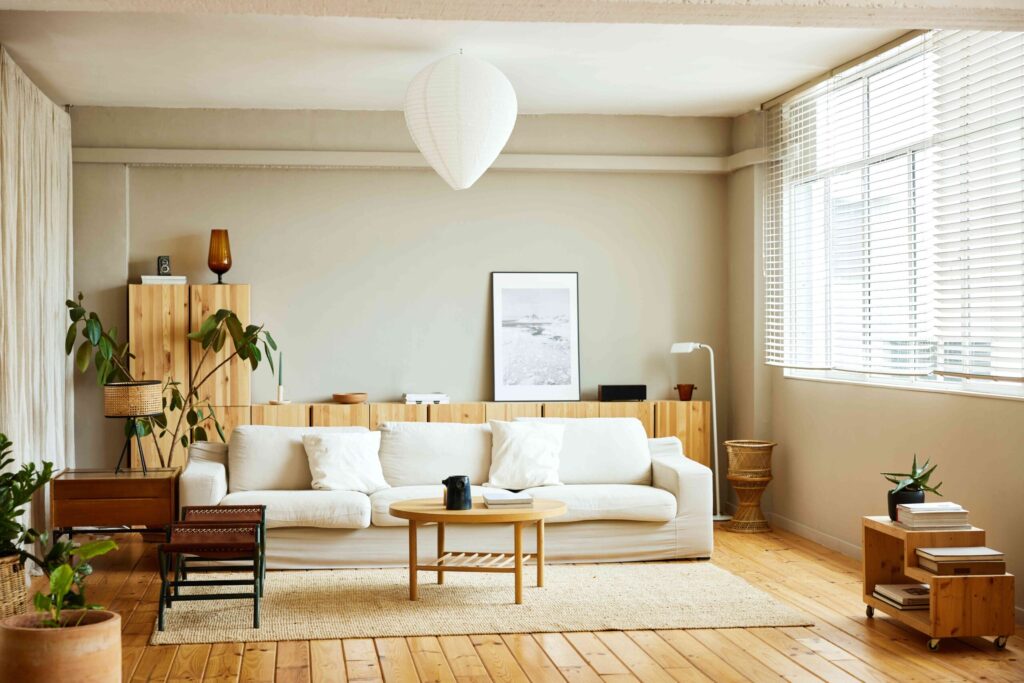
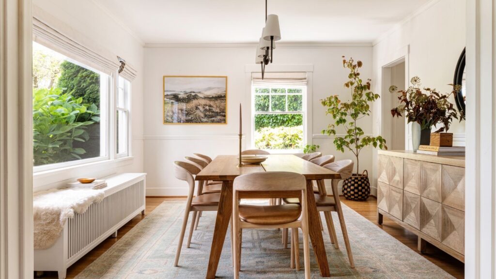
This is the foundation of most vintage interiors.
- Beige
- Cream
- Soft brown
- Warm gray
It creates a calm, grounded atmosphere that never goes out of style.
🌿 Earth Tones for a Natural Feel
Earth tones bring quiet richness into your space.
- Olive green
- Rust
- Terracotta
- Mustard
👉 These colors work beautifully with wood and natural textures.
🌸 Muted Pastels (Soft Vintage Charm)
For a softer, more romantic vintage look:
- Dusty pink
- Faded blue
- Pale sage
These colors feel gentle — almost like they’ve aged over time.
⚖️ How to Balance Your Palette
A simple rule:
- 70% neutral
- 20% secondary color
- 10% accent
This keeps your space cohesive without feeling flat.
💡 Final Thought
Vintage color palettes don’t follow trends — they create mood.
And the right mood is what makes a room feel timeless.
